
Patagonia: Taste the Earth
3D Modeling, Laser Cutting, Rebrand
This project involved rebranding the premium brand Patagonia into a bespoke chocolate company, focusing on infusing the brand’s core values of sustainability, simplicity, and connection to nature into the design.
AUG - NOV 2024
Team: Prue Steadson
Project Overview
In this semester-long project, I had the unique opportunity to rebrand the premium brand Patagonia into a bespoke chocolate company. The challenge was to infuse Patagonia's core values of sustainability, simplicity, and a profound connection to nature into every aspect of a chocolate brand, from the product design to the packaging. This endeavor was comprised of three main components: 3D modeling the chocolate, laser cutting the packaging, and designing the materials for both the chocolate and the packaging.
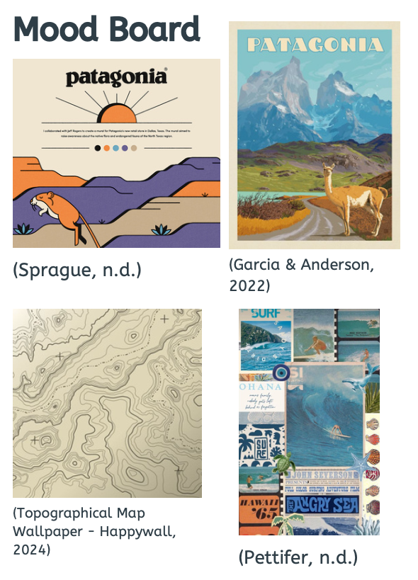

The project started with a deep dive into Patagonia’s brand identity, focusing on its environmental activism and rugged aesthetics. These elements were essential in shaping the design direction, ensuring the chocolate and its packaging resonated with the outdoor and sustainability themes of the brand. On top of this, we utilised Adobe Firefly to help spark creativity and inspiration
Design Inspiration and Concept Development
AI Concept Exploration (Firefly)
Concept 1 Prompt: Design a premium chocolate bar and packaging utilising Patagonia's visual style. Use earthy tones likes dark greens, browns, blues. The packaging should be eco friendly with a design that promotes sustainability. There should be a layer of Patagonia's outdoorsy nature.
Pros
Eco-feel: Natural paper and hand-drawn leaves reinforce Patagonia’s sustainability roots
Artisan vibes
Minimal waste: Sleeve uses minimal material
Cons
No reseal: Once opened it’s fully exposed
Material may appear stale on the shelf next to glossy competitors
Limited branding space

Concept Prompt 2: Design a premium chocolate bar with recyclable, eco-friendly packaging in Patagonia’s earthy greens, browns, and blues. Include minimalist mountain or river motifs that evoke the outdoors and reflect the brand’s commitment to sustainable design.
Functional: Resealable zipper boosts functionality
Room for storytelling: A Larger label can house nutrition info or sustainability information
Pros
Less premium feel: The pouch design almost feels more like coffee beans or trail mix
Bulky format: Doesn’t convey the chocolate bar shape
Cons

Concept Prompt 3: Design a premium chocolate bar and packaging using Patagonia’s visual style with earthy greens, browns, and blues. The packaging must be eco-friendly and fully recyclable, with subtle mountain or river illustrations to evoke Patagonia’s outdoorsy spirit.
Shelf impact: The high-quality mountain painting feels like art
Premium feel: The glossy finish signals quality
Ties into Patagonia’s outdoorsy nature
Pros
Cons
Eco trade off: A Higher quality glossy finish would not be as sustainable as a kraft-like paper.
Chocolate Bar Design
Dimensions: 160mm x 80mm, 12mm height
The design of the chocolate bar was a blend of artistic creativity and technical precision. Initial sketches focused on integrating elements reminiscent of mountainous landscapes and natural motifs. These sketches were then translated into detailed 3D models using Fusion 360, allowing for precise control over the shape and texture of the bar. The final design featured a unique, lofted terrain with minimalist illustrations symbolizing the sun, tree, and rain. These are core elements of the natural environment that Patagonia advocates to protect.

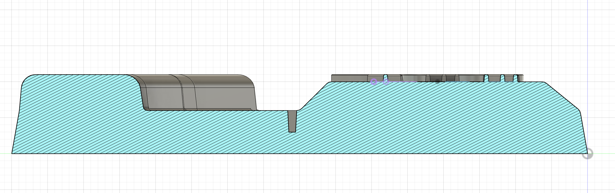
Side cross-section of the chocolate bar, with its layered shape and detailed top design visible.

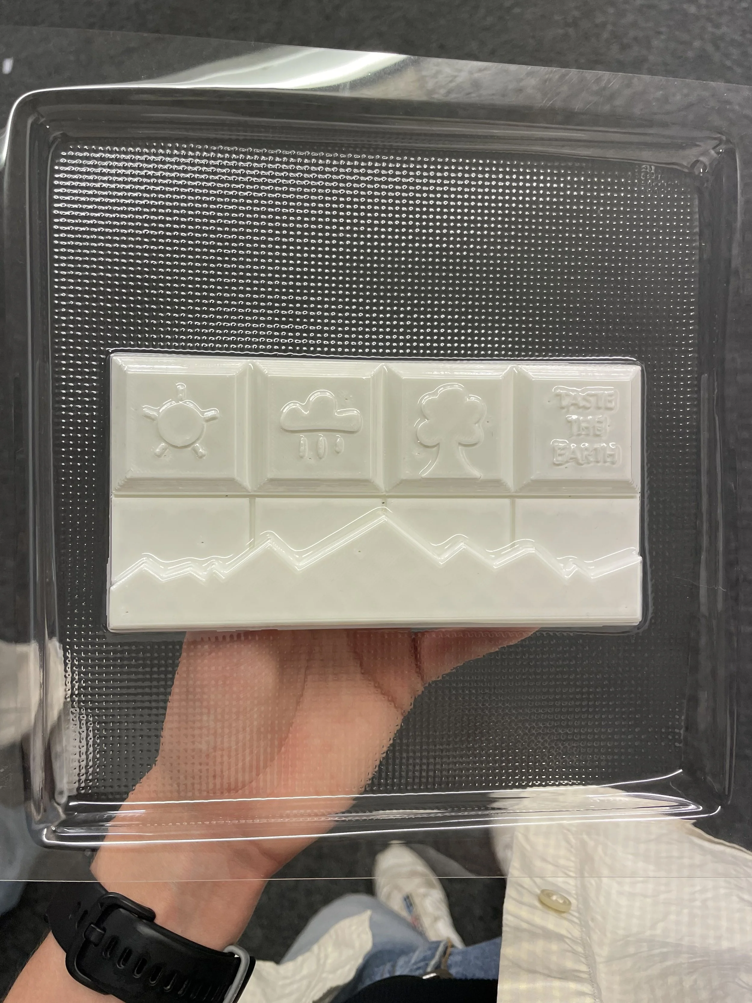
A top-down view of the chocolate bar design shows four illustrated segments: the sun, rain, tree, and text, paired with a mountain shaped base that reinforces the earthy, nature inspired theme.
Packaging Design
Materials: Selected 2.3mm boxboard for its eco-friendly attributes and structural qualities.
Design Features: The packaging integrates laser-cut patterns that mirror the textured design of the chocolate bar, creating a cohesive visual and tactile experience. A clever addition of a rope pull tab through a small hole in the inner tray enhances functionality while emphasizing the sustainable design.

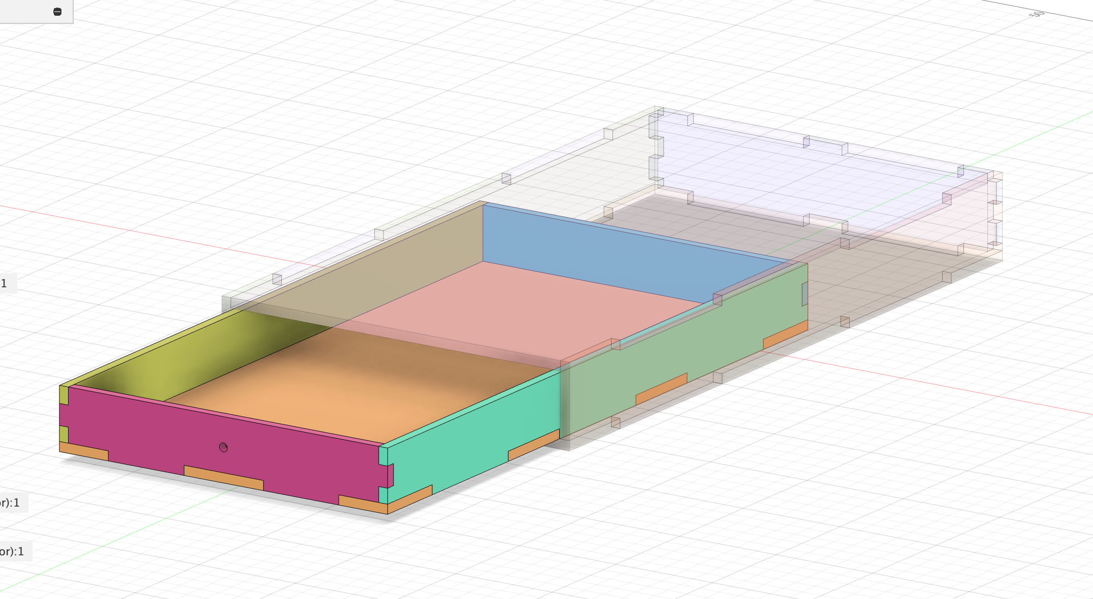
Exploded view of the laser-cut packaging design, showing how each interlocking panel fits together to form a sliding drawer box.
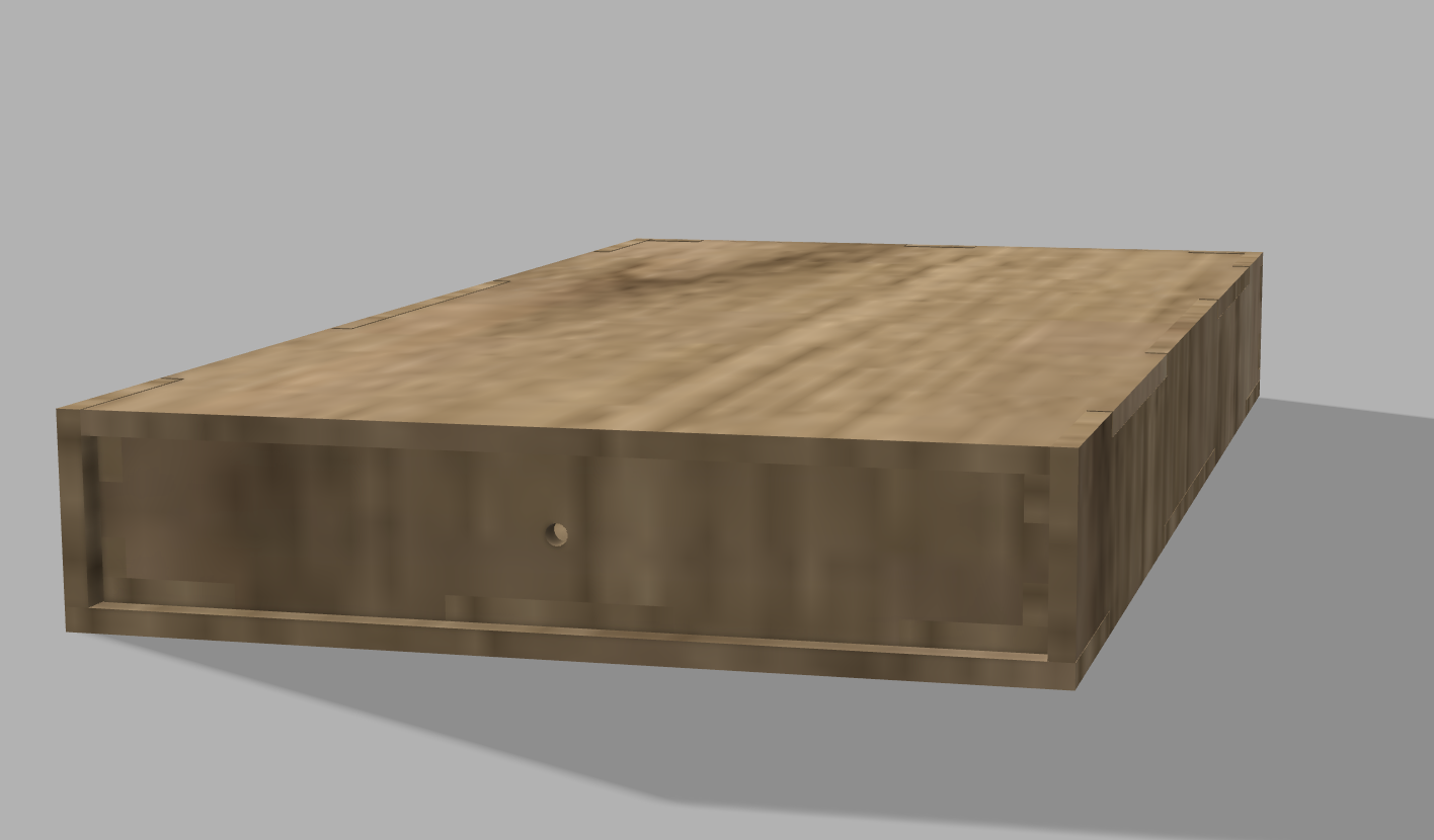
Final render of the closed drawer-style packaging, showcasing a wood-textured material finish that reflects the brand’s earthy, natural identity.
Prototyping and Production
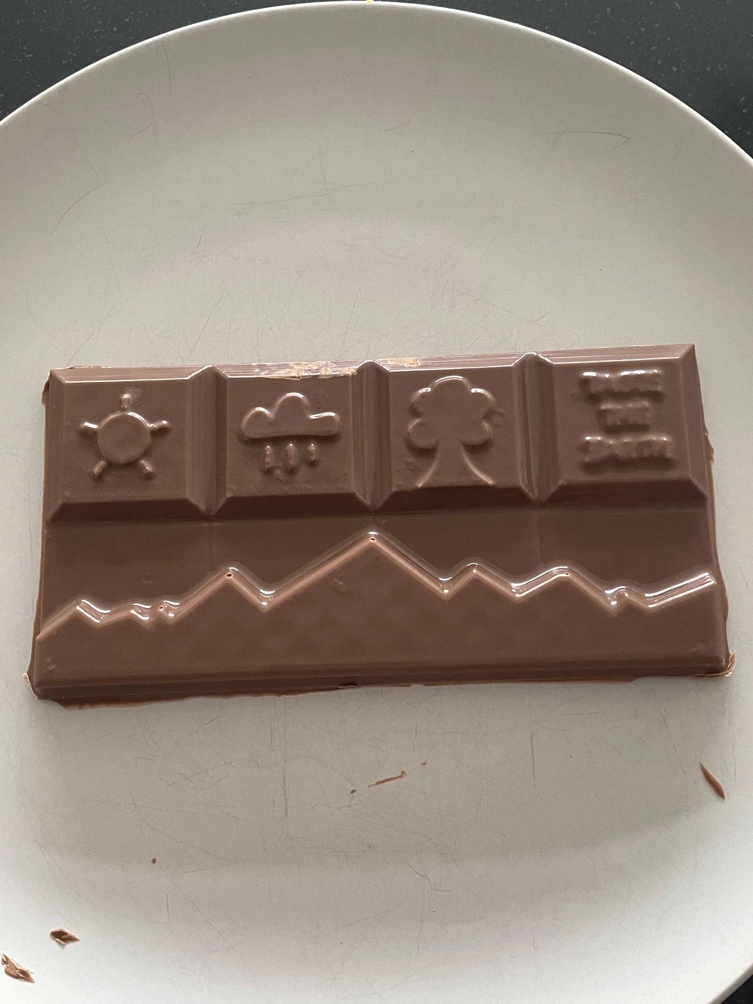
The transition from digital to physical product began with 3D printing the chocolate mould. Vacuum forming was used to create a negative mould, ensuring that key details like the mountain form and minimalist illustrations transferred well. Finally, chocolate was cast into the mould, bringing the design to life. The overall shape and terrain translated successfully, though intricate text details required refinement.
Photos showing the chocolate casting process from the vacuum-formed mould and chocolate pouring to the final finished bar with detailed raised illustrations.

Challenges and Refinements
One of the biggest challenges was transferring the small "Taste the Earth" text onto the chocolate bar. The text proved too detailed for vacuum forming and chocolate moulding at this scale. If repeated, I would enlarge the text or simplify it further. Fillets and taper angles were critical throughout the 3D model to ensure smooth mould release and prevent breakage during production.
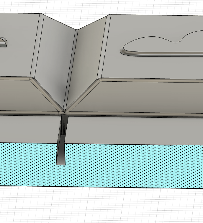
Close-up cross-section showing the deep ridge between segments and the mould taper, which would likely cause the chocolate to get stuck during demoulding due to the steep, undercut angle.

Difficulty transferring the small text of “Taste the Earth” on the chocolate bar
Material Design and Rendering

Chocolate Material
The chocolate material was created using a principled BSDF shader with a soft brown base. A noise texture and bump node were added to simulate subtle surface irregularities, giving it a natural, organic look. I initially tried a Difference blend node, but switched to a Color Ramp for better color control and richness. It has a matte, earthy chocolate finish that feels handmade and true to the brand.
Recycled Paper Material
This material simulates rough, imperfect recycled paper. I used a beige off-white base, layered with a fine noise texture and bump mapping to mimic fibers and inconsistency. The result reflects Patagonia’s preference for raw, natural textures and reinforces the sustainability story.
Sticker Material
Inspired by Patagonia’s connection to nature, the sticker material uses deep greens and blues with a paper-like matte finish. A noise texture adds slight variation and grain to reflect the imperfections of printed paper, avoiding any overly polished aesthetic.
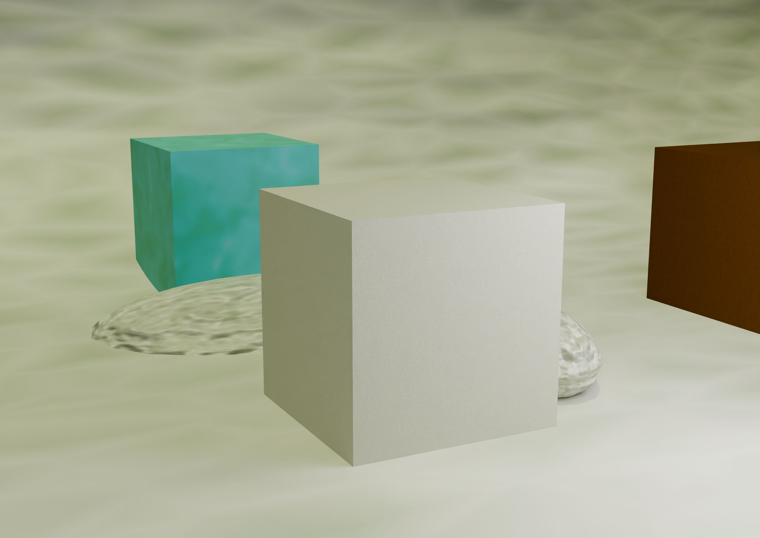
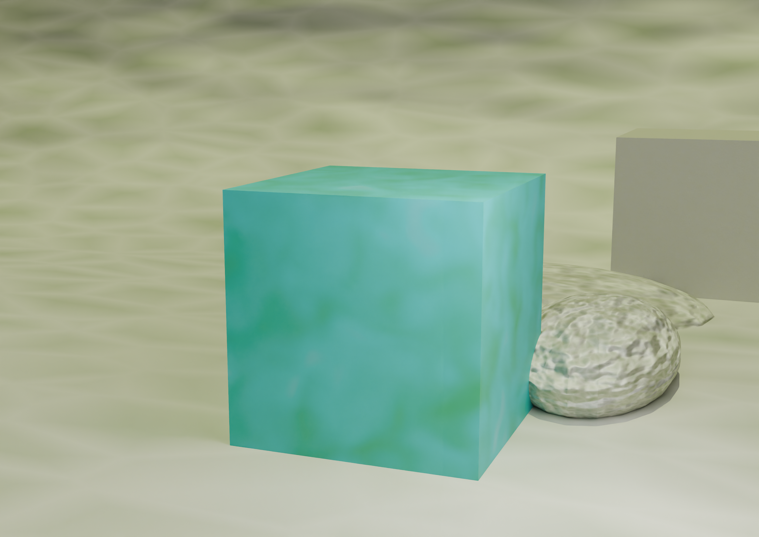
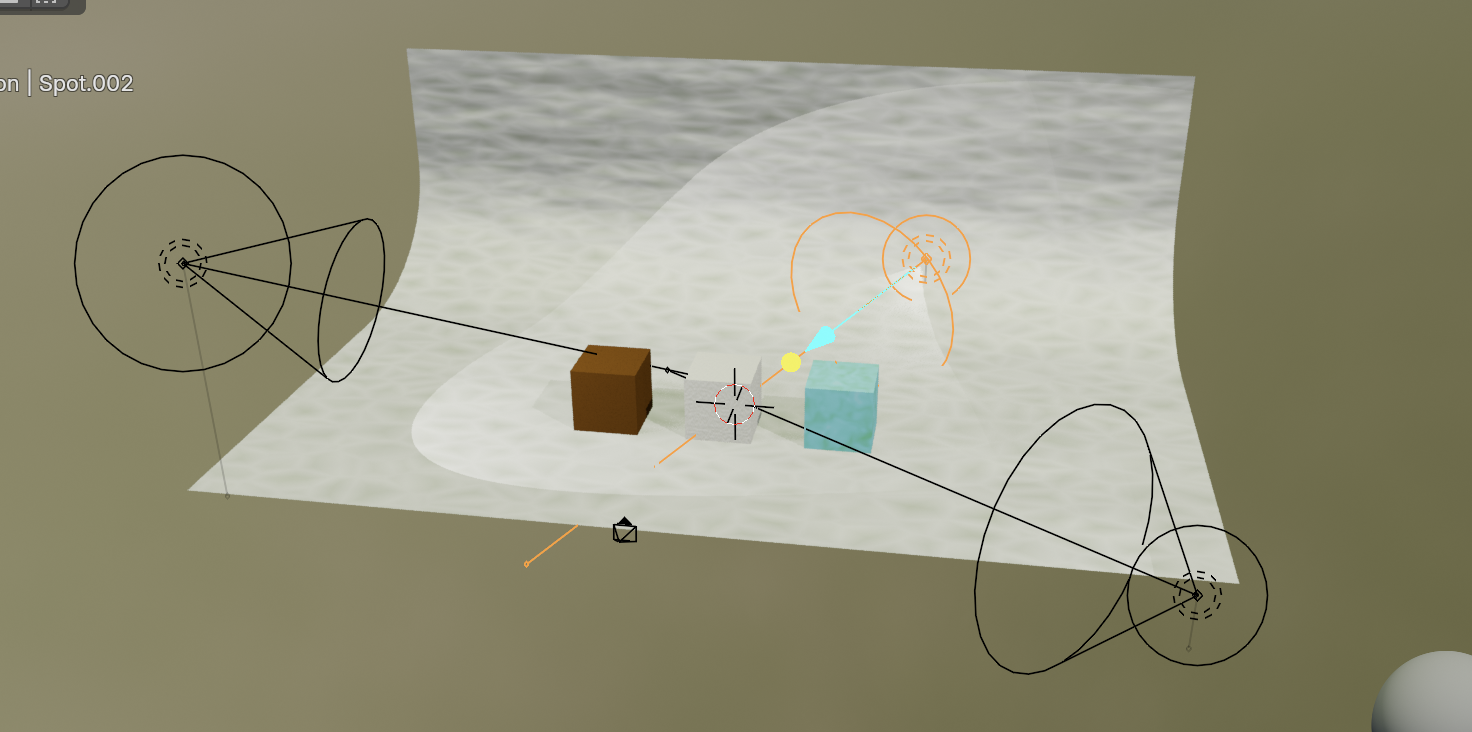
The final render scene used a tri-lighting setup combined with a soft outdoor HDRI for natural highlights. I experimented with spotlight and sun lamp strength, and composed the scene with three material cubes in a linear arrangement. Stones and an infinity wall with custom textures created an earthy, cohesive backdrop. Lighting was fine-tuned to avoid washing out key materials like recycled paper, while keeping the environment warm and grounded.
Scene Composition and Lighting
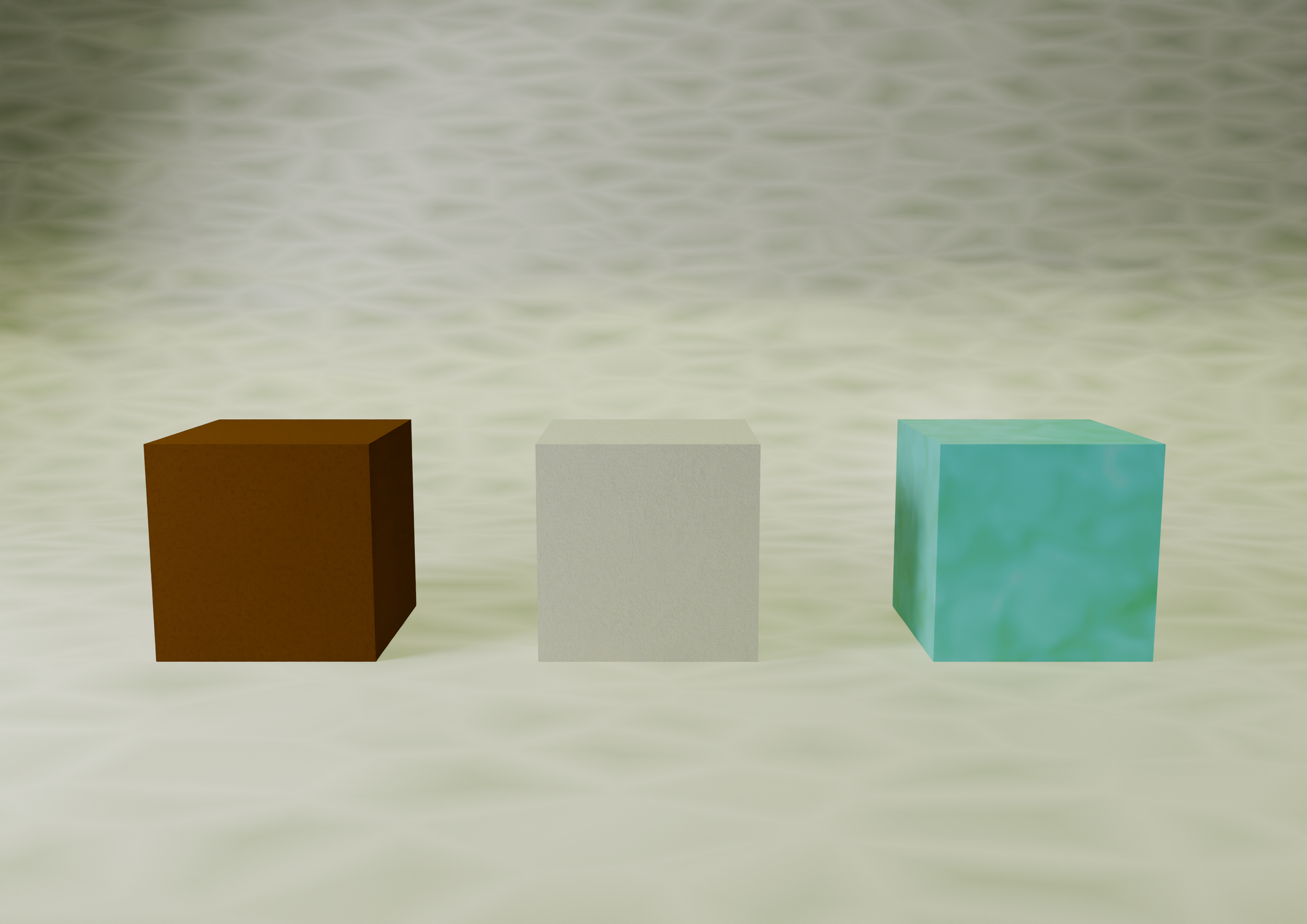
Rendered material swatches showing chocolate (left), recycled paper (middle), and a matte, grain-textured green-blue material (right) inspired by nature and printed paper aesthetics, aligning with Patagonia’s earthy brand identity.
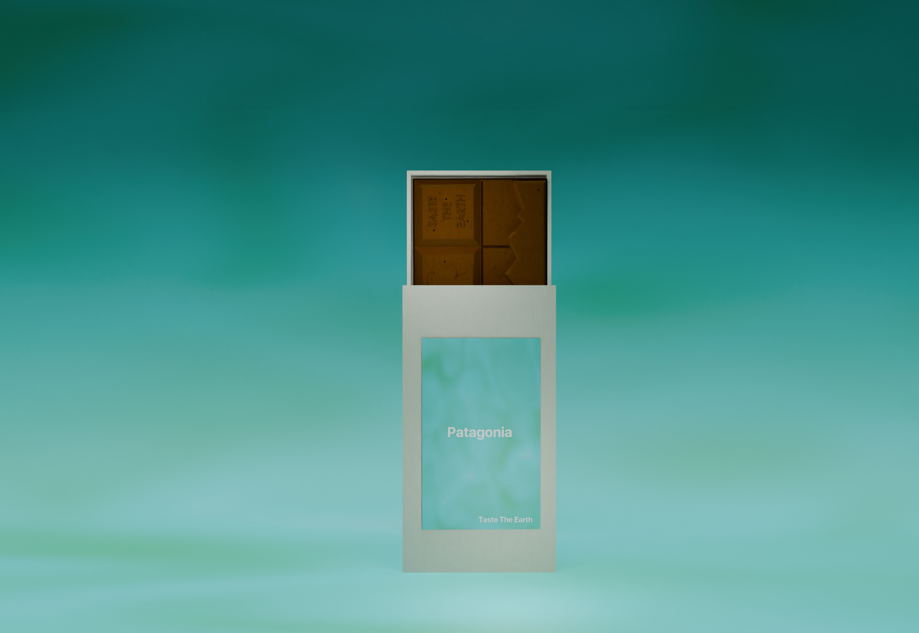
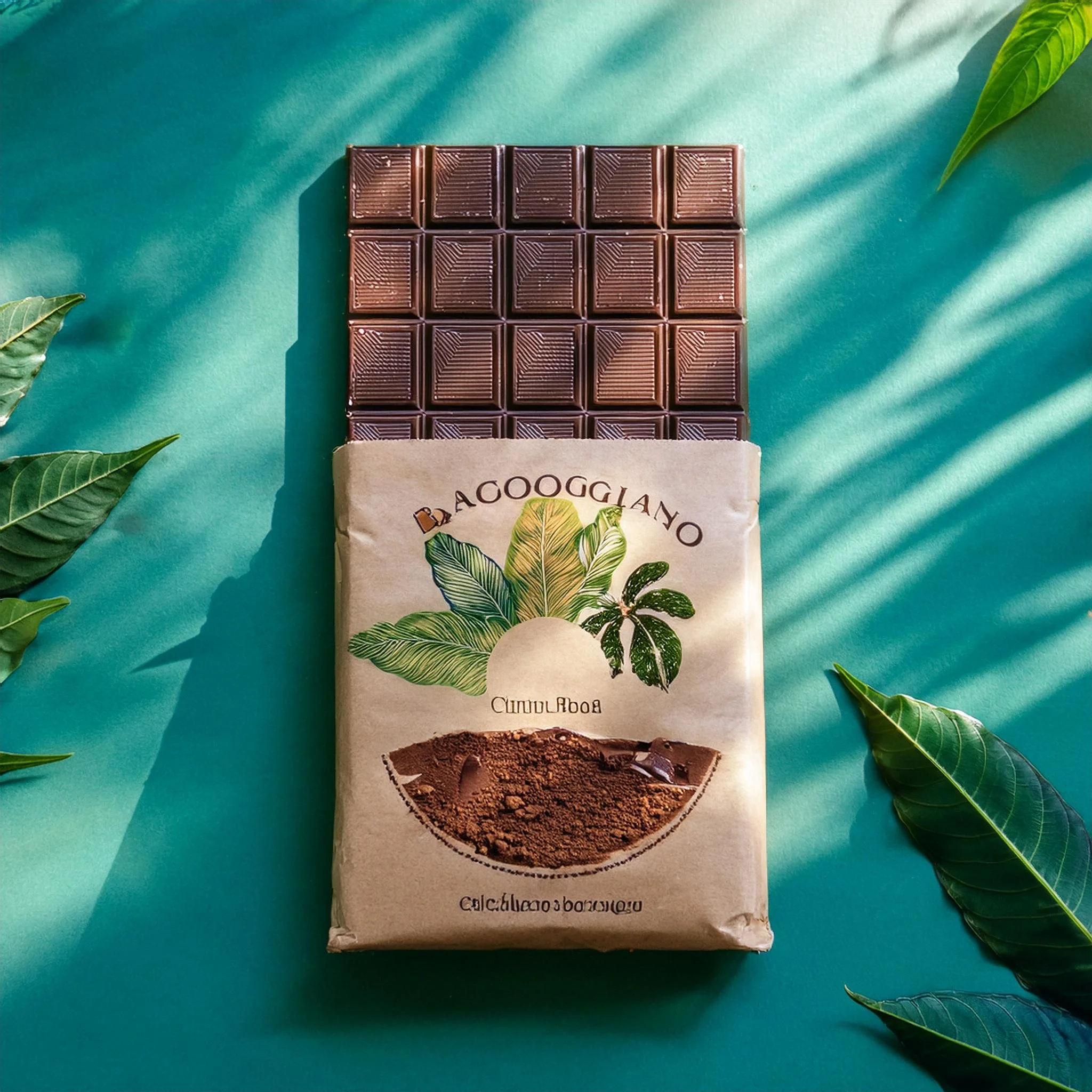
Final packaging render showing the chocolate bar partially revealed inside its sleeve, featuring a matte recycled paper wrap with a green and blue textured sticker, visually tying together the product’s earthy tone and Patagonia’s nature-driven identity.
Final Product and Expo
The final chocolate bar and packaging were presented at the Chococoture Expo. The design captured Patagonia’s identity through both form and material, showcasing a product that feels honest, earthy, and adventurous. The presentation included 3D renderings, a physical prototype, and supporting visual assets that communicated the product’s alignment with Patagonia’s values.
Final poster render showcasing the Patagonia chocolate concept, with the bar partially revealed inside a minimal, matte sleeve and paired with a bold tagline that reinforces the brand’s environmental ethos: “crafted with respect for our planet.”
